
It is highly likely that few will care to read these, and that is a-o-k with me. If I am going to get better at photography, (like most other crafts) I will need to reflect on my practice. And, if I am going to reflect, well I typically opt to journal. And… if I am going to journal, why not share it so that I can also put out some of work, keeping a running log over time of the progress that I will (hopefully) make.
One piece of the craft that I am trying to emulate from other photographers is color, espcially those smooth, pastel-types you see in beach-y scenes.
I have struggled with this a bit, but figured it would likely come down to nailing the post-processing in Lightroom after the fact – the right combination of color grading or something of the like.
However, yesterday I happened into a quick “photowalk” session that helped me appreciate something: how much the subject and lighting influence colors.
It seems intuitive, but if a subject does not have the colors that you are even remotely looking for (e.g. subtle, pastel red or blue)… well, then you are not likely to get a pastel red or blue in your photo. I say it is intuitive, but I am mostly stuck photographing in the desert, where the colors are more muted, dingy, and harsh. So, I guess I had not quite realized it yet. Perhaps my attempt to emulate a style that is more commonly used in vibrant environments is why I have struggled?


The light, too, seems to play a big factor. Again, my photos are a product of when and where I take them. Most days, I resort to dawn and dusk shooting while I walk the dog. Not only does wrangling a hounddog on a leash make it quite difficult to deliberatly approach composition (it is a dog walk, not a photo walk after all), but these hours of the day seem to make pulling color out of a scene more difficult.
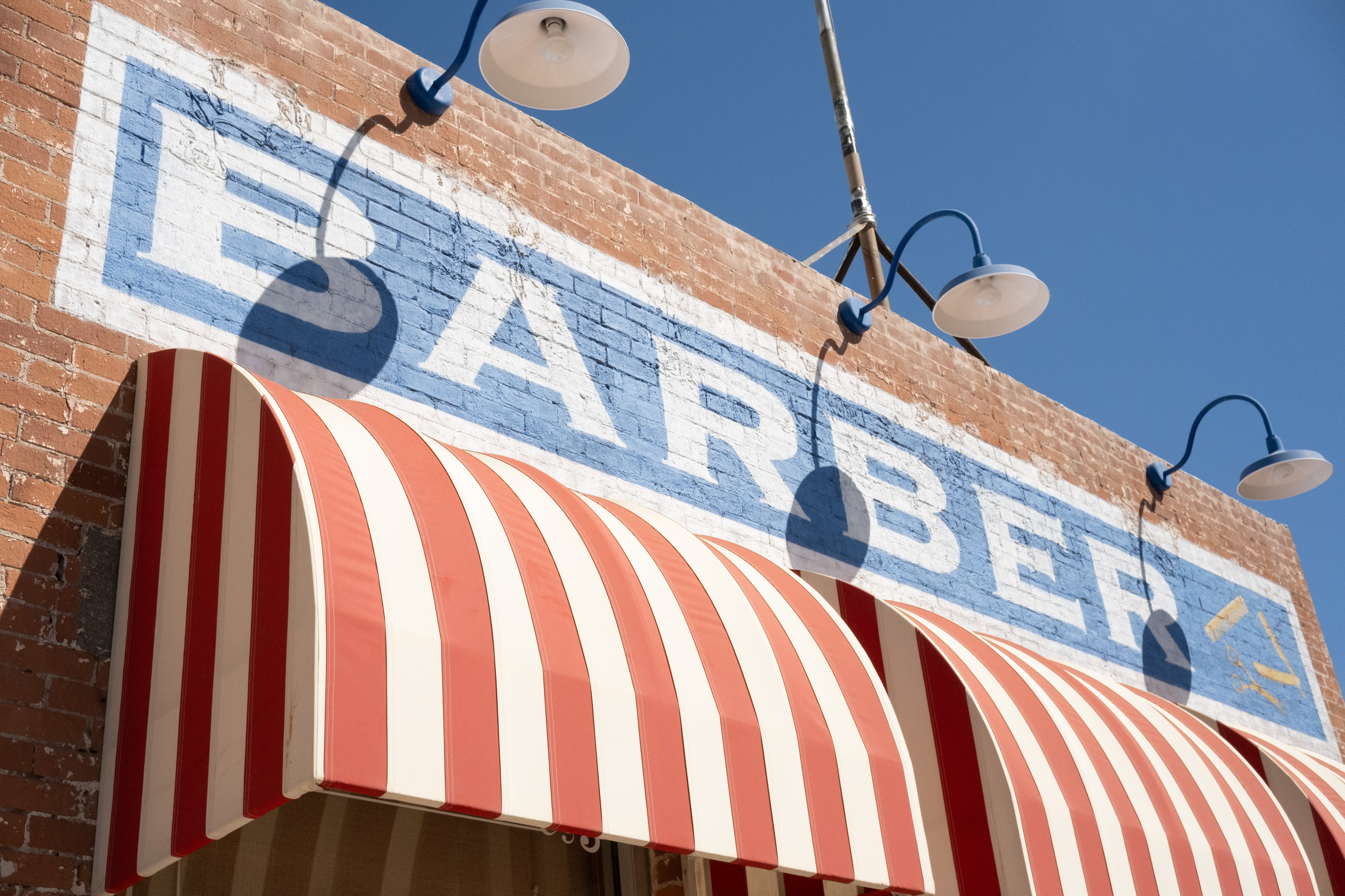
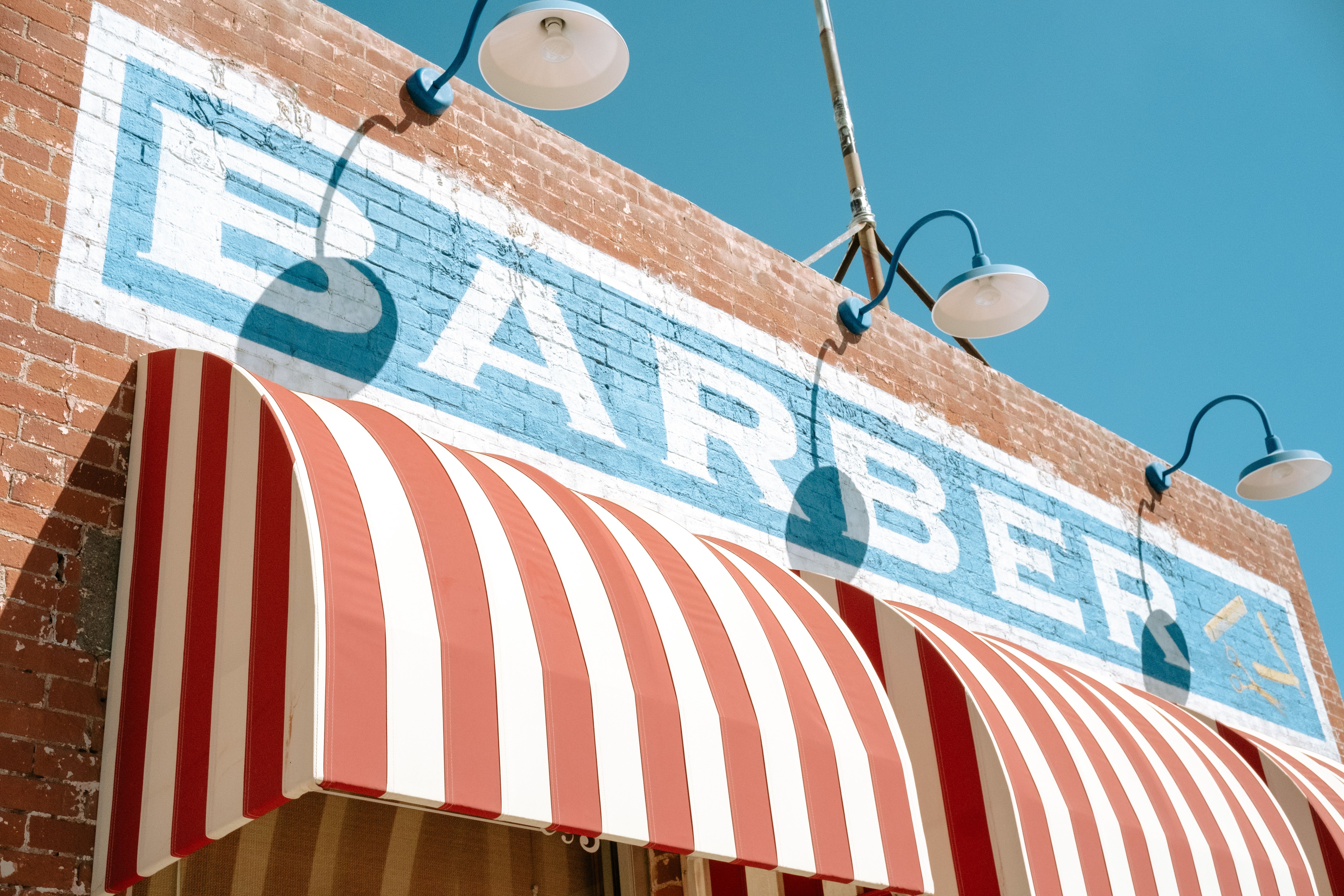
The other day, however, I was driving through a downtown-esque portion of town at around 11:00am. The sun at that time lit up the scene, while also allowing for some shadows. And, our subject (the barber shop and surrounding storefront) actually had some more vibrant colors, opposite what I normally shoot. So, I just had to stop and get some shots.
Although editing in post- did help me enhance some of these colors (see below for a comparison), even the shots straight out of the camera provided more pop than I have been used to.

Leave a comment