
For those that follow me on social media, you’ll know just how much I enjoy sharing my own personal training content: videos from my sessions, templates as I create them, and more recently my dashboard with monitoring metrics.
The latter tends to incite a lot of questions from those wondering where to begin when learning to build their own dashboards — whether it be for themselves or their athletes.
While I am certainly not an Excel expert, what I have in fact learned is how to build a first dashboard; to go from very little spreadsheet prowess to enough to build dashes like my own personal one below:

Today’s post looks at some of the initial steps that helped me build a base of Excel skills that could support the construction of a simple dashboard to monitor training data. After reading this you should, in the very least, have a decent baseline understanding that will help you as you go forward to learn more on your own from the real teachers of Excel: Google and YouTube.
For this post, we will aim to build a mini-dashboard that displays Session Rate of Perceived Exertion (sRPE) and a couple of wellness metrics; namely sleep and perceived fatigue. This will serve as the framework for the instructions below.
Additionally, I have included links to the spreadsheet example used here, as well as my own dashboard:
#1 – Lay Out Your Spreadsheet
The very first thing that I recommend doing is to set up your spreadsheet in advance of doing any real work within the document.
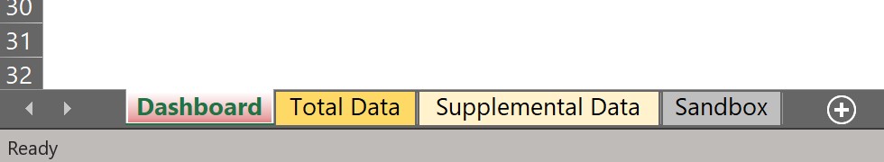
What you might need will change over time, and every person will have their own style of getting it done, but when building a simple dashboard, I personally know I will need the following tabs to start:
- Total Data — a place where the majority of the data will be dumped; tends to be the place that I put exported data from apps/program (e.g. Garmin data)
- Supplemental Data — a place for ancillary data that I end up wanting to start collecting at a later time, or data that I will be inputting manual (e.g. body weight entries every few weeks)
- Dashboard — where the visualization (and final tables) will live
- Sandbox — where I do any experimenting or sample calculations. A tab that, if deleted, would have no bearing on the final product; think of it as scratch paper
You can color-code these tabs, rename them however you like; whatever works best in your own mind organizationally.
#2 – Build a Data Table and Learn Table Features
In order for your first dash to become a reality, you need to have data, and a decent amount would be helpful. However, I would imagine you don’t want to wait X amount of days to start building, so as you build your first dashboard, I recommend using hypothetical data and then replace it with legitimate data over time.
That being said, let’s begin with building a table with fake sRPE and Wellness metrics.
Start with your columns and rows:
- Column Headers = your metrics being tracked
- Row Labels = dates
Setting your table up like the above says (and below shows) gives you data organized as such that you can chart graphs with an X and Y axis easily (more later). Below is an example:
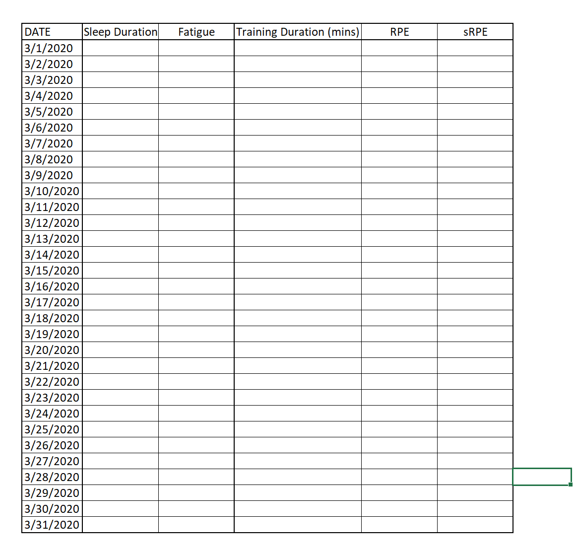
Then populate the table with your data. Again, I am using fake data:

*note: sRPE is blank because this is a calculated metric of Training Duration x RPE. We could do the math and populate it ourselves, however I prefer to let Excel do the work. More below…
Now, there is an important distinction to make when dealing with tables in Excel: you can either just have a raw table like the one above, where you typed in numbers, and the fact that it is organized as such makes it a table (in other words, because it is a collection of numbers, it is a table), however there is another option:
You can create an “official” Excel table by selecting CNTRL+L.
The distinct advantage to this is that it eventually helps automate and organize the process, as Excel will immediately recognize any data in your table’s range (even as you add data and it expands) as part of that specific table, and it will assign names to each column based upon the headers (metrics). So, for the sake of simplicity, let’s use this method.
Once you have hit CNTRL+L, it will ask you if your table has headers — our’s does, so we select “yes” and then carry on. Notice that it will alter your table in the following ways:
- It provides color formatting. You can always change this however you would like
- It adds those little arrows next to your column headers; those are for filtering and sorting the data*
*side note: you can always add these sorting/filtering drop downs to ANY table, not just an official Excel-formatted table; simply highlight the range you wish to sort/filter and then select CNTRL+SHFT+L
Now, an important step to make organization and workflow easier from here on out: you are going to want to name your table (more on how this helps below).
With any box selected in your new table, select the “Table Design” toolbar, then in the left-hand corner under Table Name, give your table any name (it must be all one word). Let’s go with “wellness”.

Naming your table comes in handy for using formulas, as it becomes quicker to tell Excel for what data you are looking.
#3 – Learn Essential Formulas
Now that we have a table, the next thing that will become helpful is learning basic formulas. I recommend the following:
- =SUM, =AVERAGE, =MAX, =MIN … and all of their derivatives; as these might suggest, they return the sum, average, maximum, or minimum value for any range of cells you give it
- For example: as mentioned above, sRPE is a calculated metric. We want to find the sRPE of each day based on the Training Duration (mins) multiplied by the RPE, and we want this to occur in column G for each date in the table. So, we do the following:
In G5 we type “=sum(“ to initiate the formula, then select/click the cells we want to multiple (in our case E5 and F5) which yields the following:
=sum([@[Training Duration (mins)]]*[@RPE])
In a regular ole’ data table, it would say =sum(E5*F5), but because it is an official table, it recognizes that you probably want this summed formula to be executed in every row of the column, so it just fills it in with the column header names.
That is the neat part about creating an “official” Excel table. It recognizes those cells as being linked to their headers (metrics). When you hit enter, it will then populate the entire column with that formula and for the given row it is in. No copy or pasting of formulas required.

Sum/Average/Min/Max/etc are simple formulas, however they can become more complex and powerful, and can help us solve a lot of questions.
For example, if wanted to return a value given a criteria; the following formulas allow us to do the same type of function (add, subtract, multiply, average, etc) but given (1) certain criteria:
- =SUMIF(
- =AVERAGEIF(
…or multiple criteria:
- =AVERAGEIFS(
- =SUMIFS(
…and one additional formula worth learning off the jump:
=Vlookup(
You will have to look up some of the uses and processes for using these yourself, however I will give you one example of a question we can answer with these formulas:
What is our average Sleep Duration on days when Fatigue = 1? In other words, how many hours of sleep did we get on average when we felt our least fatigued?
Let’s run the AverageIF formula in a cell above our table.
First, we initiate the formula with =averageifs(
Notice that a little banner pops up next to the formula once you hit the “(” symbol. It should read the following…
AVERAGEIF(range, critera, [average_range])
That banner will always be there when you initiate any formula, and I encourage you to use it.
This banner tells you what needs to come next in the formula in order for it to work. What you currently need based on where you are at in the formula is in bold.
In this case, it is going to tell us that we will need the following to complete the formula, each of which separated by a comma (,):
- range: the range for which the formula will look for the criteria you give it; we are looking for when Fatigue = 1, so we need to tell Excel to look in the Fatigue column
- You can either a) directly type the range, or b) highlight the range you want to average. Excel has a million shortcuts that make things like this easier, but we will start by highlighting. Then we add our “,” and move on…

- critera: the specific criteria (in this case, “1” under the Fatigue column) that you are looking for in that table. We want the formula to exclusively find the average for when when Fatigue = 1, so that is why we give it the value “1”
- Again, we tell it “1” (include the quotation marks). Then add “,” before moving on to the…
- average_range: as this suggests, this is the range for which you are trying to average data. In our case, we want Excel to derive the data from the Sleep Duration column.
Once all of this is in place, we can execute the formula, which returns a vale of 8 (we can verify that this is correct by manually averaging the sleep duration for the (2) instances where “1” is listed for fatigue (9 and 7 hours).

You may not need all of these formulas to begin with, however they will be crucial as you build out your dashboard over time. Personally, I believe that visuals alone are an incomplete tell of the story, so I like to see a data table below my charts.
However, if you are pulling in massive spreadsheets of data, you will need to pick out the items you are looking for in order to create a more coherent table beneath your visuals (see image below). To do this, formulas like the ones above are crucial for pulling data from one place to another.
These formulas will also help you solve for questions you have. Say, if after a month you start to wonder, what is my Acute:Chronic Workload Ratio for Session RPE? You will need to manipulate that data, and these basic formulas in combination (along with more complex ones) will be your means to do so.

#4 – Build a Chart
While we will build a quick chart to top this post off (I mean, you did come here to build a dashboard, and what is a dashboard without visualizations?), ultimately the best means for building effective visualizations is through trial and error yourself.
Why? Because, not only do we want to build graphics that represent what we want them to represent, but also it is important to recognize that each person will have their own preferences when it comes to looking at and interpreting data graphically. What works for me might not work well for you.
That being said, here is how to build a chart (and then manipulate it) from our data table. P.s. I will be doing this the “hard way” as it will help you learn the “Select Data…” feature (important as you go along).
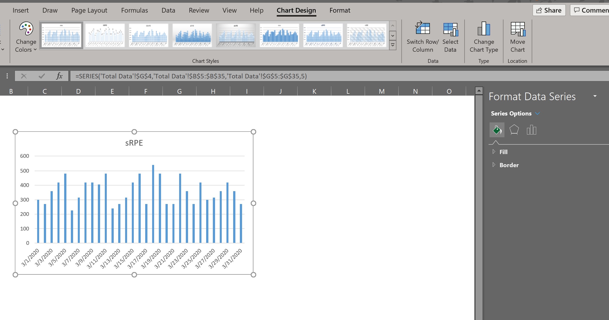
Let’s open up the Dashboard tab we made, right click, and then click the “Insert” tab on the toolbar. Once there, let’s select a chart design to help us display our sRPE over time — a Column Chart:

Notice that it gave us a blank box, as we have yet to tell it what data we want the chart to reference.
To solve for this, right click in the box and click “Select Data…“
In the box next to”Chart data range:” we have to tell it to reference our data table on the Total Data tab, so click in this box and then navigate the Total Data tab, and then select/highlight the entire table.

You’ll notice that Excel guesses, based on how we set up the Table (as mentioned in the beginning) that the first column (Dates) will be our Horizontal Axis (X-axis) and that the remaining columns — our metrics — can (when the box is checked) serve as the values for the Vertical Axis (Y-axis). In this case, we will want to un-check the boxes for everything except sRPE, and then click OK.

You now have a column chart graphically representing your sRPE over time. One final point before I let you explore on your own going forward: if you double click anywhere in the chart, it will bring up the Chart Design options, both in the toolbar up top (where you can select preset design options) and on the right-hand side (where you can get into granular formatting options (e.g. alter the scale of the Y-Axis, change the color of any one column or all of the columns, etc).
Excel has what seems like an infinite number of options depending on how you format the chart design and how you manipulate date.
While I did not give you a ton to go off of here, it is time for you to learn Excel the proper way — on your own with Google and YouTube. Trust me, it is worth the work!

Leave a comment